
|
|
|
 在 GitHub 上檢視原始碼 在 GitHub 上檢視原始碼
|
|
機率性主成分分析 (PCA) 是一種降維技術,透過較低維度的潛在空間分析資料 (<Tipping and Bishop 1999)。它通常用於資料中存在遺失值或用於多維度縮放的情況。
匯入
import functools
import warnings

import matplotlib.pyplot as plt
import numpy as np
import seaborn as sns

import tensorflow as tf
import tf_keras
import tensorflow_probability as tfp

from tensorflow_probability import bijectors as tfb
from tensorflow_probability import distributions as tfd

plt.style.use("ggplot")
warnings.filterwarnings('ignore')
模型
假設資料集 \(\mathbf{X} = \{\mathbf{x}_n\}\) 包含 \(N\) 個資料點,其中每個資料點都是 \(D\) 維度,$\mathbf{x}_n \in \mathbb{R}^D\(。我們的目標是在維度較低的潛在變數 \)\mathbf{z}_n \in \mathbb{R}^K$ (其中 $K < D$) 下表示每個 \(\mathbf{x}_n$。主軸集合 \)\mathbf{W}$ 將潛在變數與資料相關聯。
具體來說,我們假設每個潛在變數都呈常態分佈,
\[ \begin{equation*} \mathbf{z}_n \sim N(\mathbf{0}, \mathbf{I}). \end{equation*} \]
對應的資料點是透過投影產生的,
\[ \begin{equation*} \mathbf{x}_n \mid \mathbf{z}_n \sim N(\mathbf{W}\mathbf{z}_n, \sigma^2\mathbf{I}), \end{equation*} \]
其中矩陣 \(\mathbf{W}\in\mathbb{R}^{D\times K}\) 稱為主軸。在機率性 PCA 中,我們通常對估計主軸 \)\mathbf{W}$ 和雜訊項 \(\sigma^2\) 感興趣。
機率性 PCA 概括了傳統 PCA。將潛在變數邊緣化後,每個資料點的分佈如下
\[ \begin{equation*} \mathbf{x}_n \sim N(\mathbf{0}, \mathbf{W}\mathbf{W}^\top + \sigma^2\mathbf{I}). \end{equation*} \]
當雜訊的共變異數變得極小時 (\(\sigma^2 \to 0\)),傳統 PCA 就是機率性 PCA 的特例。
我們在下方設定模型。在我們的分析中,我們假設 \(\sigma\) 是已知的,並且我們不會將 \)\mathbf{W}$ 作為模型參數進行點估計,而是對其設定先驗分佈,以便推斷主軸的分佈。我們會將模型表示為 TFP JointDistribution,具體來說,我們會使用 JointDistributionCoroutineAutoBatched。
def probabilistic_pca(data_dim, latent_dim, num_datapoints, stddv_datapoints):
  w = yield tfd.Normal(loc=tf.zeros([data_dim, latent_dim]),
                 scale=2.0 * tf.ones([data_dim, latent_dim]),
                 name="w")
  z = yield tfd.Normal(loc=tf.zeros([latent_dim, num_datapoints]),
                 scale=tf.ones([latent_dim, num_datapoints]),
                 name="z")
  x = yield tfd.Normal(loc=tf.matmul(w, z),
                       scale=stddv_datapoints,
                       name="x")
num_datapoints = 5000
data_dim = 2
latent_dim = 1
stddv_datapoints = 0.5

concrete_ppca_model = functools.partial(probabilistic_pca,
    data_dim=data_dim,
    latent_dim=latent_dim,
    num_datapoints=num_datapoints,
    stddv_datapoints=stddv_datapoints)

model = tfd.JointDistributionCoroutineAutoBatched(concrete_ppca_model)
資料
我們可以使用此模型,透過從聯合先驗分佈中取樣來產生資料。
actual_w, actual_z, x_train = model.sample()

print("Principal axes:")
print(actual_w)
Principal axes:
tf.Tensor(
[[ 2.2801023]
 [-1.1619819]], shape=(2, 1), dtype=float32)
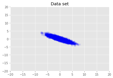
我們將資料集視覺化。
plt.scatter(x_train[0, :], x_train[1, :], color='blue', alpha=0.1)
plt.axis([-20, 20, -20, 20])
plt.title("Data set")
plt.show()
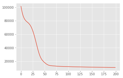
最大後驗推論
我們先搜尋潛在變數的點估計值,以最大化後驗機率密度。這稱為最大後驗 (MAP) 推論,透過計算最大化後驗密度 \(p(\mathbf{W}, \mathbf{Z} \mid \mathbf{X}) \propto p(\mathbf{W}, \mathbf{Z}, \mathbf{X})\) 的 \(\mathbf{W}\) 和 \(\mathbf{Z}\) 值來完成。
w = tf.Variable(tf.random.normal([data_dim, latent_dim]))
z = tf.Variable(tf.random.normal([latent_dim, num_datapoints]))

target_log_prob_fn = lambda w, z: model.log_prob((w, z, x_train))
losses = tfp.math.minimize(
    lambda: -target_log_prob_fn(w, z),
    optimizer=tf_keras.optimizers.Adam(learning_rate=0.05),
    num_steps=200)
plt.plot(losses)
[<matplotlib.lines.Line2D at 0x7f19897a42e8>]
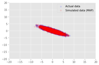
我們可以使用此模型,針對 \(\mathbf{W}\) 和 \(\mathbf{Z}\) 的推論值取樣資料,並與我們設定條件的實際資料集進行比較。
print("MAP-estimated axes:")
print(w)

_, _, x_generated = model.sample(value=(w, z, None))

plt.scatter(x_train[0, :], x_train[1, :], color='blue', alpha=0.1, label='Actual data')
plt.scatter(x_generated[0, :], x_generated[1, :], color='red', alpha=0.1, label='Simulated data (MAP)')
plt.legend()
plt.axis([-20, 20, -20, 20])
plt.show()
MAP-estimated axes:
<tf.Variable 'Variable:0' shape=(2, 1) dtype=float32, numpy=
array([[ 2.9135954],
       [-1.4826864]], dtype=float32)>
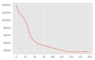
變異推論
MAP 可用於尋找後驗分佈的眾數 (或其中一個眾數),但不會提供任何其他相關深入分析。接下來,我們使用變異推論,其中後驗分佈 \(p(\mathbf{W}, \mathbf{Z} \mid \mathbf{X})\) 是使用以 \)\boldsymbol{\lambda}$ 為參數的變異分佈 \(q(\mathbf{W}, \mathbf{Z})\) 來近似。目標是找到使 q 與後驗之間的 KL 散度 \(\mathrm{KL}(q(\mathbf{W}, \mathbf{Z}) \mid\mid p(\mathbf{W}, \mathbf{Z} \mid \mathbf{X}))\)最小化的變異參數 \)\boldsymbol{\lambda}$,或等效地,使證據下限 \(\mathbb{E}_{q(\mathbf{W},\mathbf{Z};\boldsymbol{\lambda})}\left[ \log p(\mathbf{W},\mathbf{Z},\mathbf{X}) - \log q(\mathbf{W},\mathbf{Z}; \boldsymbol{\lambda}) \right]\)最大化。
qw_mean = tf.Variable(tf.random.normal([data_dim, latent_dim]))
qz_mean = tf.Variable(tf.random.normal([latent_dim, num_datapoints]))
qw_stddv = tfp.util.TransformedVariable(1e-4 * tf.ones([data_dim, latent_dim]),
                                        bijector=tfb.Softplus())
qz_stddv = tfp.util.TransformedVariable(
    1e-4 * tf.ones([latent_dim, num_datapoints]),
    bijector=tfb.Softplus())
def factored_normal_variational_model():
  qw = yield tfd.Normal(loc=qw_mean, scale=qw_stddv, name="qw")
  qz = yield tfd.Normal(loc=qz_mean, scale=qz_stddv, name="qz")

surrogate_posterior = tfd.JointDistributionCoroutineAutoBatched(
    factored_normal_variational_model)

losses = tfp.vi.fit_surrogate_posterior(
    target_log_prob_fn,
    surrogate_posterior=surrogate_posterior,
    optimizer=tf_keras.optimizers.Adam(learning_rate=0.05),
    num_steps=200)
print("Inferred axes:")
print(qw_mean)
print("Standard Deviation:")
print(qw_stddv)

plt.plot(losses)
plt.show()
Inferred axes:
<tf.Variable 'Variable:0' shape=(2, 1) dtype=float32, numpy=
array([[ 2.4168603],
       [-1.2236133]], dtype=float32)>
Standard Deviation:
<TransformedVariable: dtype=float32, shape=[2, 1], fn="softplus", numpy=
array([[0.0042499 ],
       [0.00598824]], dtype=float32)>
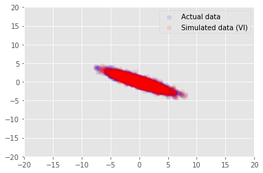
posterior_samples = surrogate_posterior.sample(50)
_, _, x_generated = model.sample(value=(posterior_samples))

# It's a pain to plot all 5000 points for each of our 50 posterior samples, so
# let's subsample to get the gist of the distribution.
x_generated = tf.reshape(tf.transpose(x_generated, [1, 0, 2]), (2, -1))[:, ::47]

plt.scatter(x_train[0, :], x_train[1, :], color='blue', alpha=0.1, label='Actual data')
plt.scatter(x_generated[0, :], x_generated[1, :], color='red', alpha=0.1, label='Simulated data (VI)')
plt.legend()
plt.axis([-20, 20, -20, 20])
plt.show()
致謝
本教學課程最初是以 Edward 1.0 編寫 (<來源)。我們感謝所有為撰寫和修訂該版本做出貢獻的人員。
參考資料
[1]: Michael E. Tipping and Christopher M. Bishop. Probabilistic principal component analysis. Journal of the Royal Statistical Society: Series B (Statistical Methodology), 61(3): 611-622, 1999.